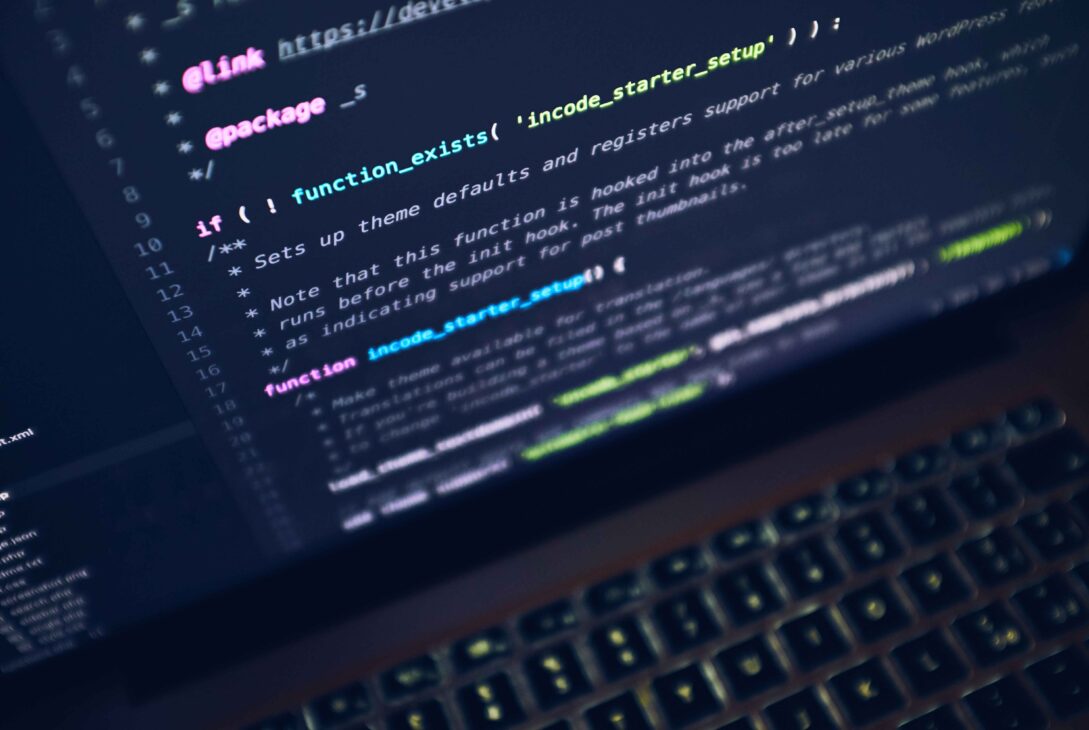
You are deep in a coding session. Hours of staring at your screen, line after line of text. Then a video pops up in your feed. A developer shows off their setup, and the font looks gorgeous. Sleek letters, a dreamy cursive style, colors that pop. At the bottom of the screen, a price tag.
Suddenly you wonder. Am I coding with a boring, cheap font? Should I be paying for something better?
You are not alone. A whole world of premium coding fonts exists, some costing real money. They promise beauty, comfort, and a setup that feels special. Meanwhile, dozens of excellent fonts sit right there, totally free.
So here is the honest question this guide answers. Are paid coding fonts actually worth it, or are the free ones just as good?
The truth might save you money, or convince you a small splurge is worth it. Either way, you will know exactly what you are paying for and what you are not. Let’s settle the free versus paid debate once and for all, with zero hype and total honesty.
Summary
By the end of this guide, you will know whether to spend money on a coding font or stick with a free one.
First, you will learn what actually makes a coding font good. This matters, because both free and paid fonts must pass the same basic tests.
Next, you will meet the best free coding fonts. Spoiler: they are excellent, and used by millions of developers every day.
Then you will explore the popular paid fonts. You will see what they offer and why some developers happily pay for them.
Most importantly, you will learn what you are truly paying for with a premium font. Some of it is real value, and some is pure style.
You will get honest pros and cons for both camps, plus a clear answer on when paid is worth it and when it is not.
Finally, you will get a bold, money-saving opinion and a look at where fonts are heading. Read on, and make a smart choice for your eyes and your wallet.
You can also read about Best Liveness Detection Software.
What Makes a Coding Font Good?
Before comparing price tags, let’s agree on what a good coding font even needs. Both free and paid fonts must nail these basics.
A coding font must be monospaced, meaning every character takes the same width. This keeps your code neatly aligned. It also must clearly separate look-alike characters, so a zero never gets confused with a capital O, and a lowercase L stands apart from the number one.
Good fonts also stay easy to read at small sizes and reduce eye strain during long sessions. Some add ligatures, which combine symbols like the arrow into a single clean shape. That is a nice bonus, not a must-have.
Here is the key point. These qualities are the real measure of a font. And as you will see, plenty of free fonts nail every single one. So what do you actually gain by paying?
The Best Free Coding Fonts
Let’s start with the free camp, because it is genuinely stacked. These fonts cost nothing, yet they power the setups of millions of developers.
The clear leaders are JetBrains Mono, Fira Code, and Cascadia Code. JetBrains Mono offers superb readability and comes built into popular coding tools. Fira Code is famous for its rich ligatures. Cascadia Code, made for terminals, is clean and modern. All three are free, open source, and constantly maintained.
The list goes deeper. Source Code Pro and Hack deliver clean, no-nonsense clarity. IBM Plex Mono brings a polished, professional look. And Iosevka lets you customize nearly everything about it.
Here is the honest truth about these fonts. They are not “budget” options. They are top-tier, professional tools that happen to be free. Many developers never feel the need to look further. So why does the paid world exist at all?
The Popular Paid Coding Fonts
Now for the premium side. A handful of paid fonts have built loyal followings, usually sold for a one-time fee rather than a subscription.
The most famous is likely MonoLisa. It is designed to boost readability and reduce eye strain, with a refined, distinctive look. Another beloved pick is Dank Mono, known for its stylish cursive italics that make comments look elegant. Berkeley Mono has also gained a cult following for its clean, retro-inspired design.
These fonts share a common thread. They focus on beauty and personality alongside function. The cursive italic styles, in particular, are a signature feature that many free fonts do not offer.
So people clearly pay for these. The real question is whether that payment buys better coding, or just a prettier screen. Let’s break down exactly what your money gets you.
What You’re Actually Paying For
This is the heart of the debate, so let’s be crystal clear. When you buy a premium font, you are paying for a specific set of things. Some are valuable, and some are simply nice.
You are paying for refined design and personality. Premium fonts often have a polished, carefully crafted look, plus special touches like beautiful cursive italics for comments. You are also paying for a curated experience, since a paid font is one confident choice rather than endless free options.
Some premium fonts do genuinely aim to reduce eye strain through thoughtful spacing and shapes. That comfort can matter over long hours.
But here is what you are not paying for. You are not buying better code, faster typing, or fewer bugs. A font cannot do those things. The core job, clear and readable code, is handled just as well by the top free fonts. Premium mostly buys aesthetics and joy, not productivity.
Are Paid Coding Fonts Worth It?
Time for the honest verdict. Are premium fonts worth your money? The answer depends entirely on what you want.
Here is my bold opinion, and I will stand by it. For most developers, you do not need to pay for a coding font. The best free fonts are so good that a paid one will not make you a better or faster programmer. If budget matters at all, keep your money.
That said, paid fonts are worth it for some people. If you spend all day staring at code, love a beautiful setup, and a font brings you genuine daily joy, then a small one-time fee can absolutely be worth it. Think of it like a nice keyboard or a comfy chair. Not required, but a pleasure.
So there is no single right answer. The free fonts win on pure value. The paid fonts win on style and personal delight. Neither choice is wrong.
Honest Pros and Cons of Each
Let’s lay it out plainly, so you can decide fast. Here are the real trade-offs for both camps.
Free fonts, the pros. They cost nothing, they are top quality, and they are widely supported with big communities. Many come built into your tools. Free fonts, the cons. The sheer number of choices can overwhelm you, and few offer fancy cursive italic styles.
Paid fonts, the pros. They offer refined, distinctive designs, special features like elegant italics, and a curated, premium feel. Some genuinely focus on eye comfort. Paid fonts, the cons. They cost money, the practical benefit over free fonts is small, and you often cannot fully test them for free first.
The pattern is clear. Free fonts are the smart default for nearly everyone. Paid fonts are a treat for those who value the extra polish and can spare the cash.
How to Choose the Right One for You
So how do you actually decide? Follow this simple path, and you will land on the right choice with no regret.
Start free, always. Download a top free font like JetBrains Mono or Fira Code and use it for a couple of weeks. It costs nothing and might be all you ever need. Most developers stop right here, perfectly happy.
Only consider paid if you feel a real pull. If you have used free fonts and still crave a specific premium look, like those cursive italics, then explore a paid option. Look for one that offers a trial or clear previews so you know what you are getting.
Here is a final money-smart tip. Never buy a font you have not seen in your own editor first. What looks amazing in a demo can feel different in real code. Looking ahead, expect even more high-quality free fonts and flexible “variable” fonts that adjust to your taste, making the free camp stronger every year.
You can also read about Emerging Digital Marketing Trends.
Conclusion
The free versus paid debate is settled, and you came out the winner. You know what makes a coding font good, and that both camps must pass the same tests.
Remember the key takeaways. The best free fonts, like JetBrains Mono and Fira Code, are genuinely top-tier and cost nothing. Paid fonts like MonoLisa and Dank Mono offer beautiful design and special touches, but not better coding. You pay for style and joy, not productivity.
Above all, remember this. For most people, free is the smart, satisfying choice. A premium font is a small luxury, worth it only if the beauty brings you real daily happiness.
Here is your one clear next step. Before spending a cent, install a top free font tonight and code with it for two weeks. If it feels great, you just saved your money. If you still crave something more, then and only then, explore a premium pick.
So tell me, are you happy riding with the excellent free fonts, or is a beautiful premium font a splurge you would gladly make?